Wednesday, 11 August 2010

JJ Hampson


JJ Hampson
Folk / Acoustic / Pop


I made a myspace account, and i wrote as my 'about me' ' Hello, im not really a myspae user, i use facebook and twitter, but i have re-joined because im looking for unsigned artists to use for my A2 project, i need to create a music video to a piece of music, so if you could recomend any artists to me that would be a great help thanks :)'


Unfortunatly nobody suggested any bands to me, so i spent a good hour and a half going through myspace music. I came across three bands i really liked. Unfortunatly only one of them replied, but im really enthuistic about using his music. I have already had some great idea for the video in my head and cannot wait to experiment them.


I am working with Alanah Sullivan in this project, and we decided to pick a few bands we like, email them and then decide which ones we will use, and if we have enough time we could do more than, or even take a bit of the music from every track.


This is my email i sent to JJ Hampson asking permission to use his music, and his reply is also there. If you click on the photo it will come up bigger on your screen :)


Me and Alanah both emailed a couple of artists. We were left with two that replied to us, giving permission for us to use one of their tracks. We did not use this artist above in the end, because we thought we could match alot more lyrics to visuals using Evelyn Burke, and would be alot more successful using her track.


Tuesday, 10 August 2010

Narrative/Audience/Genre Theory

Goodwins Theory

Andrew Goodwin came up with a theory for music videos

- A relationship with the music and the visual motion movie. The visuals trying to illuminate, amplify and contradict the music. The editing can be influenced buy the pace or tempo of the music video.

- Music with a particular genre may have their own style of music video or iconography, for example a heavy rock band making their music video of them on a line stage performance.

- Record companies are demanding that music videos include lots of close up shots on the main artists or vocalists.

- The artists can create a star iconography throughout their videos, which can then become their stage image aswell as music video image, for example Lady Gaga uses obscene videos but also on stage her style is still inappropiate style and unique.

- There is a good chance that videos use intertextual references to either music videos, films or Tv texts.

- In some music videos there is references to voyeurism , esspecially for treatement towards women, there is also the effect of the notion of looking, this is by use of the cameras, shots also screens withon screens.


The notion of looking;
Andrew Goodwin suggested in every music video there is a refernce to looking.
For example;
-screens within screens. ( bad day, red hot chilli peppers)
-telescopes
-eyes
-mirrors
-looking glass
-indirect/direct adress
-voyeurism (Made to look at it as something in an appealing way. E.g Lady Marmalade is a modern vogue show girl/brothel. This gives off a sexual tension, which is something you cannot avoid looking as theres nothing else their in the shot.


Pink- Who Knew
In this music video we are made to look at Pink, as the background and everything around her is faded and she is in focus (focus pulling), she gives us direct adress by looking straight into the camera so it looks like she is personally looking directly into our eyes.
She is in bright clothing and the background of the fairground is in dull colours, we then get the impression her facial expressions are important, and she is singing about herself. The background is less important yet shows us the story she is singing in visuals of two young actors. We see everyone else as just a busy crowd and nothing important.

The couple who are playing out the story never look at the camera, they are constantly giving us indirect adress. This gives off the effect that we are watching over them, and they do not know this.

At the end of the video she used indirect adress for a bit and as soon as the music fades she looks up and uses direct adress right untill the end, this gives off a powerful effect.


How goodwins theory can influence Our Music Video
Goodwins theory has inspired me to have a sucessful music video. His theory can help me structure my music video, in which then i can expland to make ours unique yet still sucessful. By having our genre of music relate to our visuals so it suits the song. Because our music video doesnt come under a catogorie, we decided to do ours concept based, picking up on more abstract images, this way the visuals will match the music and be attractive to watch as the music will fit in perfectly.
Whilst editing our videos we have captured, we will make sure the tempo and beat of the music fits in perfectly to our visulas, which will make sure the audience have an enjoyable watch, and it will be sucessful. W are also going to match the visuals to the lyrics, so that our music video does not look like something totally random we have decided to do. We have many relations to the tracks name, and the niche of lights. We will be sucessful in doing this.

Intertextuality and Music Videos


Music videos have been around since the 1920's. Many Jazz musicians of that time, for example Bessie Smith, made short clips to go with popular songs.
In the 1970's the record industry discovered Tv Shows as a opportunity to promote artists. Short 'promos' they created started to replace the live performances of the artist on the Tv.
1975 Bohemian Rhapsody released a huge successful video which was released by Queen. They made the begining og the video era and set the trend for the modern music video. The video is considered to be one of the first ever to use advaned visual effects.

Since cinema came around, it created the ability to bring songs and music to life. The advances to technology have changed the music video industry into the great success it is today with amazing visual effects.

Directors who started making music videos;
David Fincher, he made Madonna (material girl), Vogue and Express yourself
Spike Jonze, made Fatboy Slim and Praise You.
Michael Gondry created Bjork and Foo Fighters music videos.


Intertextuality examples;

Red Hot Chili Peppers - californication
The intertexulity used is a video game.
The movement of the characters in the video game fits into the beat perfectly by the transitions and movements.
The characters of the game look asif they are singing to the song also. The lyrics fit in perfectly also, when the band mention a pregnant woman in their song, an animation of a pregnant woman appears in the action game. So not only does the music video fit into the beat, it fits perfectly in with visuals too.
The audience relises eventually that the aim of the game is to collect certain tockens to gain more points, the tockens are the bands logo, so they use their brand identity also, we notice that the animations in the game are actually the members of the band, they look really simular.
I think this is really successful because the video is narrative based through a video game, this engages the audience as we are interested all the time in what is going to happen next to the anaimations in the video, whilst we still see the bands personal touches by including their logo, and the the characters are them too, the music video does not contrast with the lyrics atall, they have included many anaimations, and effets to match the lyrics. The music video is of a high quality also.


Gorillaz - Clint Eastwood (their first video)
The inspiration of Thriller by Michael Jackson comes into the video at some point.
This music video is really clever as the visuals match the music.
The Gorillaz have used their anaimation video as their brand indentity, all their music videos and album covers, images ect are all animated.


1993 REM- Bad day
They have used the theme of a TV news report.


The music fits in really well with the transistions,
all news reporters sing the lyrics. There are many effects like two people talking to a news reporter in their home with a rain cloud above their head to refelect their mood.


Intertextuality is also in fashion and photography.
1999- Shania Twain- Man I feel like a woman.
She was inspired by Robert Palmer- Addicted to Love.
Shania copied the video with just a few personal changes. The video is really simple, they both consist of the lead singer at the centre of the screen singing down a micro phone, dressed in lovely clothes that were the fashion at the time, sourounded by models, Shania chose male models, all good looking and again, dressed in fashionable clothes asif it was a cat walk.
On the other hand, Robert Palmer used female models.
Neither of the videos tell a story, they both just include models in the background looking pretty/handsome but really they are just posing and not even playing their instruments.
These music videos are perfomance based.
I think this works well in both music videos as they appeal to both genres, the male are atrracted to the Shania Twain, and female to the male models at the background.

Quotes;

John Stuart- 'Incorparating, raiding and reconstructing essentailly the essence of intertexuality.'

'Generate both potentially nostalgic associations and new meanings'

'Use something the audience may be familuar with to'

'Possibale exeption of advertising'


Unfortunatly, because of limitation of resources/software available at schools, we cannot make any musi videos to the high standard these are.

Target audience


Lily Allen


is an English recording artist, talk show host, and actress. She is the daughter of actor and musician Keith Allen and film producer Alison Owen. Allen abandoned school and concentrated on improving her performing and compositional skills. She created several demo songs, and near the end of 2005, she created a profile on MySpace, where she made some of her recordings public.


Her second major album release, It's Not Me, It's You, saw a genre shift for her, having more of an electropop feel. The album debuted at #1 on the UK Albums Chart and the Australian ARIA Charts. She is making music of "experimentalism and fearlessness". I think her album attracts mostly young women.


Lily Allen Lyrics

Lily Allen - Smile Lyrics
When you first left me
I was wanting more
But you were ***king that girl next door
What'cha do that for?

More Lily Allen - Smile Lyrics
Lily Allen - The Fear Lyrics
I want to be rich and I want lots of money
I don't care about clever I don't care about funny
I want loads of clothes and fuckloads of diamonds
I heard people die while they are trying to find them

More Lily Allen - Ldn Lyrics
Lily Allen - Alfie Lyrics
Ooh deary me
My little brother's in his bedroom smoking weed
I tell him he should get up ?cause it's nearly half past three
He can't be bothered ?cause he's high on THC

More Lily Allen - Everyone's At It Lyrics
Lily Allen - I Could Say Lyrics
I could say that I'll always be here for you
But that would be a lie and quite a pointless thing to do
I could say that I'll always have feelings for you
But I've got a life ahead of me and I'm only 22


The website i used to research Lily Allen was http://oh-lily.com/wp/


Lady Gaga

'The first artist to have her first five six singles reach number one. She's won two Grammys, and has sold 8 million albums and 15 million singles digitally worldwide.'

Lady Gaga is very successful in targeting her audience, she does this by creating a remeberable name which is unique and easy to remeber.
She is deffinetly an inspiration to all young, men, women, homosexuals.
I think this because

Her rise to fame is from her outragious wacky costumes used in public which leaves everyone speechless everytime. She once wore a constume made out of an entire collection of Kermit the Frogs.
Lady gaga deffinetly appeals to the crowds! She has given the market exacly what they want, she appeals to the dance and pop market, she sings songs that people like to listen to.
She is constantly promoting her products. She promoted herself in all sorts of projects and world tours, so she is well known around the world!
Her lyrics are very catchy and easy to sing, she is enthusiastic and does well to express who she is, she has not changed her appearance or her performance, which is why we love her. And already Lady Gaga has been compared to Madonna and Gwen Stefani.


Lady Gaga doesn't like to refer to people as her "fan", instead she names them "Little Monsters."
She has tattooed "Little Monsters".
By giving her fans a name, they feel like they are joining a alsmost fan club, and feel more personal to Lady Gaga.


Her website http://www.ladygaga.com/theremix/


Monday, 19 July 2010

Music Videos


Lady GaGa – Bad Romance NARRATIVE BASED

The colours mainly used in this music video is red and white. They are contrasting colours, when she is dressed in white with a pale background she looks innocent and pure. When she is dressed in red with a dark background she gives off connotations of a firey anamalistic sex appeal. She gives direct adress in particular when she looks like this.

Lights flash and cut to the beat of the music deliertly.

story.. man buys her

product placement..vodka

editing follows softer beats, this makes it not so harsh or fast.

editing shown clearly is her eyes are made bigger.


Green Day – American Idiot PERFORMANCE BASED

This music video is at a constant fast pace, giving an image of total chaos.
There is a massive open space

unusual shots

movement speed- all three at different speeds at the same time, one will be sped up, another will be slowed down and the last will be normal.

american flag melting in the background pouring out with green liquid is a symobol of america, green-rotten destroying the flag- corrupt of the country.

green and black.


OK-Go – Here it Goes Again CONCEPT BASED (2, 975,789 views on utube)

8 tredmills
doesnt tell a story- very abstract
lipsincing movements to the beat of the music.
very simple but very effective
clothing very vibrant against the dull background.

Thursday, 15 July 2010

Promotional Websites and Fansites

Red Hot Chili Peppers;


http:/redhotchilipeppers.com/
Brings you to this first page. The colours are very dark and mysterious, with a film tape positioned at the top of the screen with coloured images which draw our eyes straight away. These photos are repetitive, of their album name, with 'red hot chili peppers' printed at the top. They have done this for visual advertisment staright away.
There is no clutter on the page, meaning it is quite a simple layout but very effective, we can see the background does look quite busy with the dark edges, faded middle and black lines heading in different directions, but the tape strip stand out, so we know where we are focusing on. The colours match well and are not contrasting, so it look attractive to the eye. When we look at a webiste, in the first two seconds we judge it by these conventions, so the construction of the site has straight away gained the audiences attention.


We can easily see the navigation bar to the right of the film stip which stands out in bold red, with the band
s logo next to it. In white it says 'go to' so we know they are links below we can click on to view their main website. 'Drive in', 'news' and 'log in'. the log in will be for fan members to sign up to be a part of the website more than for example me who will simply click 'drive in' to look around their website for a generall interest.
The font used throughout is the same font they have used on their logo.
Again, this is advertising their trade mark on their website, and showing to the audience their unique look they have made for the band.

When you click on the link 'drive through' this will take you to the main part of their website so you can navagate around. This looks like the image on the right.


The site is divided in different categories; news, fleamail, community, tickets, contest, virtual tickets, exclusives, discovery and store. These different links are placed on the left side of the page running down. The effect of this is good because you have time to look at the design on the website. The text is black on white so does not clash and is easy to read considering the text size is pretty small!
The picture just positioned off the centre is of their album name,using colours to match the background. The background is quite dusky and dark, but i think the use of suttle colours suits the image of their album. There is a photo of four people next to a car in black and white. They are not the band members, so i am not sure why they are placed there, but the use of clothes and e.g the woman with the tattoos suits the genre of music. I like how they are in black and white, because it makes the page more suttle and easy on the eyes, so there are no clashing colours or vibrant to put the audience off. They have set a mise-en-scene delibartly, it reminds me of California, which could be ironic as they have a song named 'californication' and this is where the band come from.

The audeience can see videos and photos of the band,

I think this website is really successful. They involve the audience into their band, because they have made a 'contest page' and have a 'sign up' for real fans, so they can send the band emails, and enter in the cometitions, the band members can also send them things about them on new upcoming events, so they really involve the audience.
The website itself, is easy on the eye, and shows their brand identity all the way through so the audience can get to see their unique design.


Wednesday, 16 June 2010

Album covers

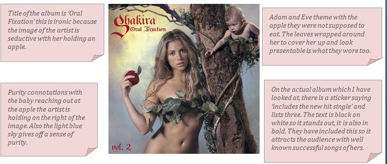
If you click onto the image, it will become larger so you can read it :)


Purity connotations with the baby reaching out at the apple the artist is holding on the right of the image. Also the light blue sky gives off a sense of purity.


Title of the album is ‘Oral Fixation’ this is ironic because the image of the artist is seductive with her holding an apple.


Adam and Eve theme with the apple they were not supposed to eat. The leaves wrapped around her to cover her up and look presentable is what they wore too.


On the actual album which I have looked at, there is a sticker saying ‘includes the new hit single’ and lists three. The text is black on white so it stands out, it is also in bold. They have included this so it attracts the audience with well known successful songs of hers.


The writing on the back of the album saying the title is the colour red. This gives of devilish connotations, also the font gives this image too.Because of all these aspects, it shows a more daring attitude instead of pure.

On the other hand, the back of the album cover is different. The colour of the sky has turned dark to represent night time, the baby has gone and the use of along shot it used for the singer to show her full body. This makes it a less pure image and again, more seductive.

‘Bonus track’ written on the back attracts audience as they believe its something new and extra. The song titles are written in white so they stand out with the dark background.